
Hemingway novel inspires design
Binghamton faculty member creates typeface

Alessandro Segalini tossed a novel in his bag as he set out with friends during a break from his studies as an industrial design student at the Polytechnic University of Milan in 2002. The book was Il Vecchio e il Mare (The Old Man and the Sea) by Ernest Hemingway. It was a fitting choice since the group was headed to Otranto, Italy, a coastal town located near the juncture of the Adriatic and Ionian seas.
Segalini intended to use the trip to reflect on his idea to design a typeface for his master’s thesis.
“I believe books choose you,” says the assistant professor of art and design.
“They ask you to take them down from the shelf and when it’s time, they ask you to read them.”
As a result of reading that novel during the trip, Segalini was inspired to translate the symbology of the story into a typeface for his thesis project.
“I knew I wanted to work on alphabets and after reading that story, I thought I could use it to create something beautiful,” he says.
Segalini was struck by the story’s realism.
“I had never read anything so in your face. You are feeling what the fisherman is feeling. For me it was a discovery, a kind of epiphany,” he says.
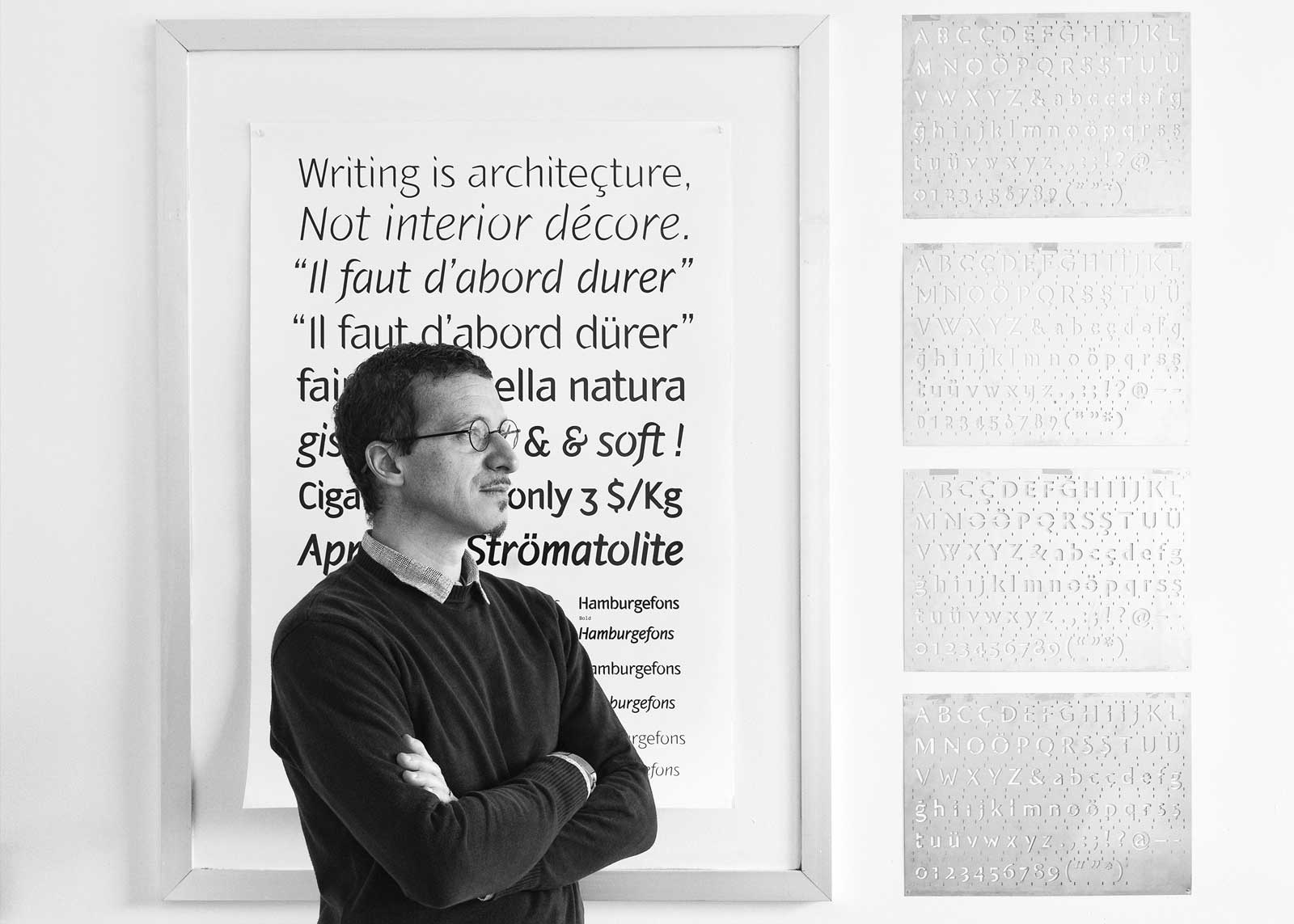
Segalini spent dozens of hours researching the novella, Ernest Hemingway, calligraphy and typography. He also sketched hundreds of characters, his inspiration coming from a hand-painted sailboat logo he had seen on a boat in Otranto. After refining his designs many times, Segalini created a typeface that he named “Hemingway.”
“In the story, nature is cruel and bad, but it’s also tender and loving. I wanted my shapes to express this dichotomy, this dualism. So, there are many sharp details, but mixed with soft curves.”
Published in 2009, Hemingway is a typeface family with eight variations. There are roman and italic styles in light, book, medium and bold weights.
“When you design a typeface, you’re designing a system,” Segalini says. “For basic Latin, you have 26 uppercase letters, 26 lowercase letters and 10 numbers. But you also have punctuation, symbols, diacritics and styles.”
In a conference paper, Segalini wrote, “I wanted my typeface to carry the meaning of sharpness and harshness, to be fine and at the same time holding a stiff and a soft quality, the same qualities in which the nature of the sea is revealed in Hemingway’s novel — a book that indeed speaks about the fairness of nature, the love of the hunter for the prey and vice versa.”
In 2011, Segalini’s Hemingway was featured in the British publication Creative Review Type Annual, which showcased international typeface design. It was selected among the best designs in the Display Text category. Segalini is uncertain how many times the Hemingway fonts have been purchased.
However, the typeface is being used in a unique way at Izmir University of Economics in Turkey, where Segalini was formerly on the faculty. Doors in the university’s new Fine Arts and Design building have glass cutouts in the shape of several Hemingway letters.
“I got the idea to use the uppercase characters as glass peepholes so the students can see through the door and light can come through as well,” Segalini says. “The doors have become landmarks. People say, ‘Let’s meet by the H!’”
Hemingway is available from myfonts.com.