Bartle Library showcases data through art
Third-floor exhibit shares library data through artistic installation
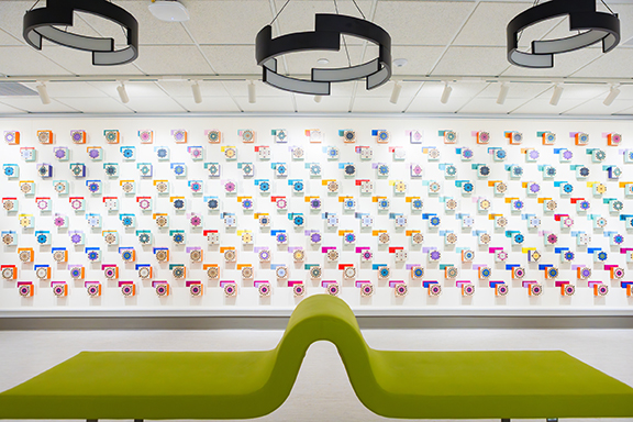

Three-dimensional cubes featuring various patterns, shapes, and colors cover a feature wall. Upon closer inspection, it is clear that each detail serves a purpose to describe an item including year, title, and location. This combination of art and information is an impressive installation for any art gallery. However, this eclectic art display has a unique location on the Glenn G. Bartle Library third floor — a fitting home as the art is a physical representation of the research held at Binghamton University Libraries.
Installed at the end of the fall 2025 semester, the exhibit showcases an artistic representation of the top 20-most circulated items from different categories within the Libraries’ collection. Aside from the year and title of the item, each color, pattern, and line correlate to a specific area of study, location, and number of times borrowed. A collaboration with the University Libraries and Pentagram, an independent design firm located in New York City, the exhibit serves as a way to examine the Libraries’ collection itself, bringing the hidden to the forefront.
“Libraries generate and steward enormous amounts of information about research, learning, and community engagement, but that data is rarely presented in ways that highlight its human dimension,” Dean of Libraries Andrea Falcone said. “This exhibit connects our internal data with the lived experiences of our diverse campus community. By doing so, it reveals how the library’s work — often behind the scenes — has a deep and longstanding impact on teaching, scholarship, and student success.”
Inspired by the works of Giorgia Lupi, award-winning information designer and champion in data visualization, this data-driven exhibit was created by Lupi herself. Familiar with her work through her publications “Dear Data” and “Speak Data,” the opportunity to fill the newly renovated gallery space with a unique piece of art that speaks to the work the Libraries engages in seemed to be a natural fit.
“Giorgia Lupi’s superpower is creating data visualizations,” said Carrie Blabac-Myers, the Libraries’ director for academic, community, and global engagement. “Her data-driven art is perspective shifting and her handcrafted style makes number sets magical. The original postcards featured in her book Dear Data are part of MOMA’s permanent collections. Giorgia was the perfect artist to create something next level for the gallery space.”
Meetings with the Pentagram team and Lupi began a year prior to discuss how to take all the data about the Libraries’ collections and represent it in a visual medium. Sifting through the data and evaluating the gallery space on the third floor of Bartle Library was a steady process.
“Early meetings revolved around describing the complexity of academic library systems to Pentagram’s team,” Blabac-Myers said. “Together we decided what proprietary data would tell the Libraries’ story best. At first the process was linear. Raw data was populated into spreadsheets. Then, members of the Pentagram team made an on-site visit for a campus tour. They captured patterns and textures from the Libraries’ physical spaces with 3D modeling and spatial tracking. At that point the design started to take shape and both teams knew we had something special.”
The collaboration between Binghamton University Libraries and Pentagram was unique, as both sides had something to offer in the collaboration. For the artists, it was a peek behind the scenes on the inner workings of a library, while the library was able to discover new meaning in the data it had. Throughout the project, both were able to bring something to the table to create an exhibit that is both visually appealing and has personal impact.
“From the beginning, the Pentagram team and Giorgia Lupi were deeply interested in understanding what academic libraries actually do — what makes our work distinctive and how we support our campus community,” Falcone said. “Libraries are steeped in data, but we don’t always know how to translate that information into meaningful stories. Through the collaboration, we explored how our own datasets intersect and how they can be interpreted in ways that highlight the human-centered impact of our work. The process was both energizing and illuminating, and it helped us see our own data, and our role on campus, in new ways.”
While the gallery provides an impressive and impactful visual representation through an artistic lens, it also provides an interactive means to engage with data itself. On the opposite wall of the gallery, visitors are encouraged to answer three questions using magnetic markers with the color pertaining to their area of study. The participatory element, along with using a key to decipher the art itself, makes the exhibit an active experience with data.
“One of the most powerful aspects of the exhibit is that it tells a rich story through visually stunning representations of our data,” Falcone said. “But it’s not just something to look at—it’s something to participate in. Visitors are invited to respond to reflective questions about the values and challenges that libraries uphold. Using colored magnets that represent different interests or perspectives, they can add their own voice to the exhibit. In that way, the installation becomes a living conversation about what people care about — knowledge, access, preservation, equity, discovery—and the role libraries play in supporting those shared values.”
This exhibit is now on view in the Glenn G. Bartle Library gallery on the third floor during open library hours.