Demystifying science: How graphic design can democratize knowledge

How can graphic design participate in the work of democracy?
By making complex concepts accessible to non-specialists, good design can empower citizens to make the best decisions for their society. That was the belief of Otto Neurath, who invented the Vienna Method of Pictorial Statistics — later known as the International System of Typographic Picture Education, or isotype — in the early 20th century.
The Austrian sociologist and political economist was the subject of a March 30 lecture by University of Vienna research associate Gernot Waldner on “Designing Democracy: Possible Lessons from Otto Neurath’s Museum of the Future (1925–1934).” Waldner also edited a recent volume on Neurath that includes contributions by Binghamton faculty; two of them, Associate Professor of Art and Design Gökhan Ersan and Associate Professor of Art History Pamela Smart, joined Waldner to discuss their own design and pedagogy work with the Materials Matter initiative.
Neurath was the founding director of the Social and Economic Museum of Vienna. The social democratic municipality of Vienna financed the museum, open from 1925 to 1934; the institution sought to educate citizens by bringing statistics to life. It featured detailed charts as permanent and traveling exhibits, in addition to other informational displays, such as an exact model of a gynecologist’s office.
Neurath believed that scientific expertise should be separate from political decision-making; in his view, experts shouldn’t anticipate political decisions, but instead relay accurate information to the decision-makers — citizens — who can then decide on the best possible outcome.
“He believed the democracy must mean more than casting a vote once every couple of years. He called for the active involvement of various groups in society, chosen by profession or age; carpenters, teachers, housewives, youth, seniors and other groups should form councils and be informed by scientific experts about current issues of political concern,” Waldner said.
Many of his ideas, such as the councils, were never fulfilled. However, Vienna’s ruling party was committed to education, and built many libraries, tested experimental forms of schooling, offered psychological counseling for parents and children, and supported Neurath in his plans for democratic education, Waldner said.
For seven years, visitors could see an exhibit on society and the economy; unlike many exhibits of the day, both the display and guided tours were free of charge, and there was no dress code. The exhibit covered the history of humanity in broad strokes, from hunter-gatherers to agriculture, urbanization and ultimately industrial production. The intent wasn’t to laud the virtue of progress, but to point out current problems, such as the disappearance of democratic governments in Europe, the deliberate destruction of food to raise prices, or the connection of life expectancy to social class, Waldner explained.
“The museum saw itself as an intermediary between academic expertise and the democratic public,” he said.
The isotype system
The museum was a busy place, with 36 exhibitions that took place in seven countries during its run. During the breaks between commissions, its team of scientists and designers worked on honing the systematic language behind the Vienna Method.
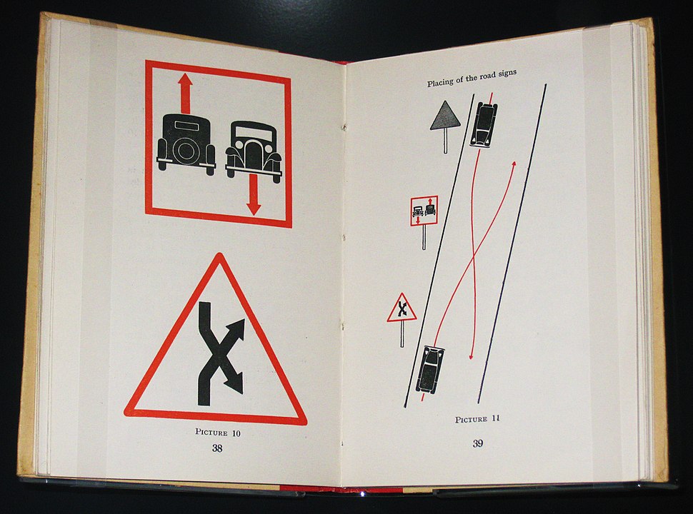
The isotype system had several requirements: Symbols should be clear and unambiguous, and mathematically readable so that viewers can calculate with them. Having the reader work out the math displayed in the images — such as the percentage of soldiers left as invalids following the first World War — was believed to encourage learning, Waldner explained.
“The goal is to raise questions and make the spectator curious for further data,” he said. “Knowledge about the public should be freed from its state patronage and made available to the public.”
To ensure that the displays were easily understood, the museum solicited feedback through questionnaires and made changes accordingly. Up to 20 versions of many graphics survived, Waldner said. Demands on tour guides were also high: they needed to be able to explain the social and economic context of the exhibits. Ultimately, Neurath’s goal was to create a quiet, contemplative atmosphere in which reflection and inquiry were possible.
During his talk, conducted on Zoom, Waldner shared some of the museum’s charts, which appeared strikingly contemporary. Images of slumped individuals showcase unemployment in different countries. A spread of green shows the extent of the Eurasian forests, and colorful blocks demonstrate the location of highly developed ancient cultures in Mexico. Another graphic showed the continuing impact of slavery in South Carolina, 60 years after it officially ended; yet another displayed common breakfast foods and their international origins, as a demonstration of the global supply chain.
“My punchline for this chart is that there is no continental breakfast, there are only intercontinental breakfasts,” Waldner quipped.
Materials Matter
Binghamton University’s Materials Matter initiative also makes complex subject matter more accessible to a wider audience. Funded by a National Endowment for the Humanities grant, the interdisciplinary initiative combines the sciences and the humanities for an in-depth look at pigments, class and ceramics that range from laboratory science and physics to history and aesthetics, Smart explained.
Professors from 16 different departments have taken part; partners also include the University’s Undergraduate Research Center and the Corning Museum of Glass. As a general education course, students also come from a range of backgrounds, from science fields to the humanities and arts.
“The mix of students this achieves has been central to the cross-pollination that the course seeks to promote,” Smart said. “The curriculum has been designed to draw the humanities and sciences into conversation with each other.”
In the class, students learn about methodologies of analysis from both STEM and humanities sides, engage in hands-on learning experiences from making pigments to creating frescoes, and go on field trips to locations such as the Corning Museum of Glass. Above all, they learn how to answer complex questions: How can you tell if a painting is authentic or fake? Why does this pigment look green to the human eye?
Questions such as these are deceptively simple, but draw on a wide range of knowledge, Ersan pointed out. To “release the knowledge” from specific scientific specialties, graphic designers such as Ersan sit down with materials scientists to determine the best way to represent these concepts and relationships.
Just like Neurath’s isotype system, scientists and designers work out a visual language to convey information: in the case of the color question, they began with the structure of an atom. Working on this project for a few months, they began to realize that the periodic table of elements and atomic structure echo each other, which deepened the understanding that went into the graphic design.
A graphic or animation can communicate ideas without specialized language or math equations, effectively condensing chapters of a physics textbook into a single image. It’s a kind of storytelling that demystifies science and makes it more accessible to a wider audience, much in the way of Neurath’s graphics.
“We had these big textbooks of physics that explain the building blocks, but those books cannot really explain the full story of, for instance, why an emerald is green, because it’s the entire textbook (that explains it),” Ersan said.